Your cart is currently empty!
Experiencing the World in Colors
Back to: Full STEAM Ahead

Why are Colors Important?
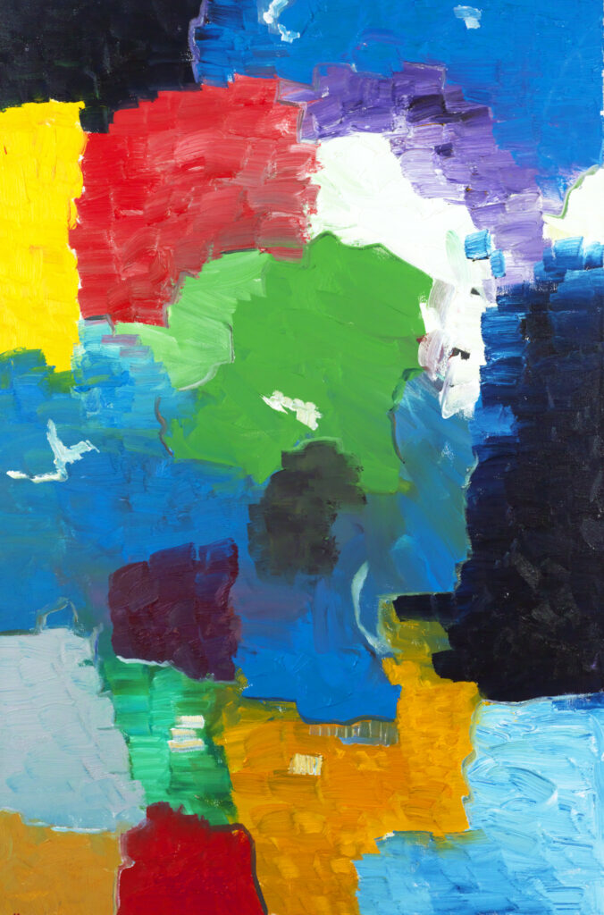
The presence of colors in our world makes life more enjoyable. Colors can affect our mood and stimulate the brain. Without color, it would not be possible to express oneself when creating visual art entirely. In short, Colors are beautiful!
Color influences our emotions, perceptions, and behaviors, often subtly but significantly. Understanding these effects can help us create environments and experiences that support our well-being and desired outcomes.
Click here to learn how different colors make us feel
Colors have a profound impact on our brains and emotions, influencing our mood, behavior, and even physiological responses. This phenomenon is known as color psychology. Here’s how different colors generally affect our brain:
1. Red:
- Stimulates Excitement and Energy: Red is associated with increased energy levels and can raise heart rates and blood pressure. It often evokes feelings of excitement, passion, and urgency. This is why it’s commonly used in warning signs, stoplights, and sale promotions.
- Can Trigger Aggression or Anxiety: In some contexts, red can also provoke feelings of anger or anxiety, making it a double-edged sword in terms of its psychological impact.
2. Blue:
- Calming and Soothing Effect: Blue is often associated with calmness and serenity. It has been shown to reduce stress and lower heart rate and blood pressure, making it a popular choice in spaces designed for relaxation, such as bedrooms and hospitals.
- Enhances Productivity: Blue can also stimulate the mind and improve focus and productivity, which is why it is frequently used in office environments.
3. Yellow:
- Boosts Mood and Positivity: Yellow is often linked to happiness, optimism, and energy. It can stimulate the brain’s pleasure centers, making people feel more cheerful and energetic.
- Can Cause Fatigue or Anxiety: However, in large amounts, yellow can be overwhelming and may cause feelings of frustration or anxiety.
4. Green:
- Associated with Balance and Harmony: Green, often associated with nature, can evoke feelings of peace, balance, and relaxation. It’s considered restful for the eyes and can help reduce stress.
- Enhances Creativity: Green is also thought to encourage creativity, making it a good color for workspaces where idea generation is key.
5. Purple:
- Promotes Creativity and Imagination: Purple is often associated with luxury, creativity, and spirituality. It can stimulate the imagination and is often used in artistic or meditation spaces.
- Can Convey Mystery or Ambiguity: Purple’s rarity in nature gives it an element of mystery and ambiguity, which can be both intriguing and unsettling.
6. Orange:
- Energizes and Stimulates Social Interaction: Orange combines the energy of red and the cheerfulness of yellow. It is often associated with enthusiasm, warmth, and playfulness. It can stimulate social interaction and increase energy levels.
- Can Be Overwhelming: In excess, orange might be too stimulating, leading to feelings of restlessness or irritation.
7. Pink:
- Calms and Soothes: Pink is often seen as calming and nurturing. It’s frequently used in environments intended to be soothing, such as hospitals or spaces for children.
- Associated with Compassion: Pink is also linked to love, kindness, and compassion, often invoking a sense of care and nurturing.
8. Black:
- Evokes Power and Sophistication: Black is often associated with authority, power, and sophistication. It can create a sense of mystery and formality.
- Can Induce Sadness or Fear: On the downside, black can also evoke feelings of sadness, negativity, or fear, depending on the context in which it’s used.
9. White:
- Associated with Purity and Simplicity: White is often linked to cleanliness, purity, and simplicity. It can create a sense of space and openness.
- Can Feel Sterile or Cold: However, too much white can feel sterile, impersonal, or cold, which is why it’s often balanced with other colors.
10. Gray:
- Neutral and Balanced: Gray is seen as neutral, calm, and balanced. It can create a sense of sophistication and stability.
- Can Be Perceived as Dull or Depressing: On the flip side, gray can sometimes be perceived as dull, uninviting, or even depressing if overused.
11. Brown:
- Warmth and Comfort: Brown is associated with warmth, reliability, and comfort. It’s often linked to nature and earthiness.
- Can Be Perceived as Boring: However, like gray, brown can also be perceived as dull or boring if not used thoughtfully.
Context and Cultural Influence:
- Cultural Differences: The impact of colors can vary depending on cultural context. For example, while white is often associated with purity in Western cultures, it can be associated with mourning in some Eastern cultures.
- Personal Experiences: An individual’s personal experiences can also influence how they perceive certain colors. A color that brings joy to one person might evoke sadness in another, depending on their past experiences.
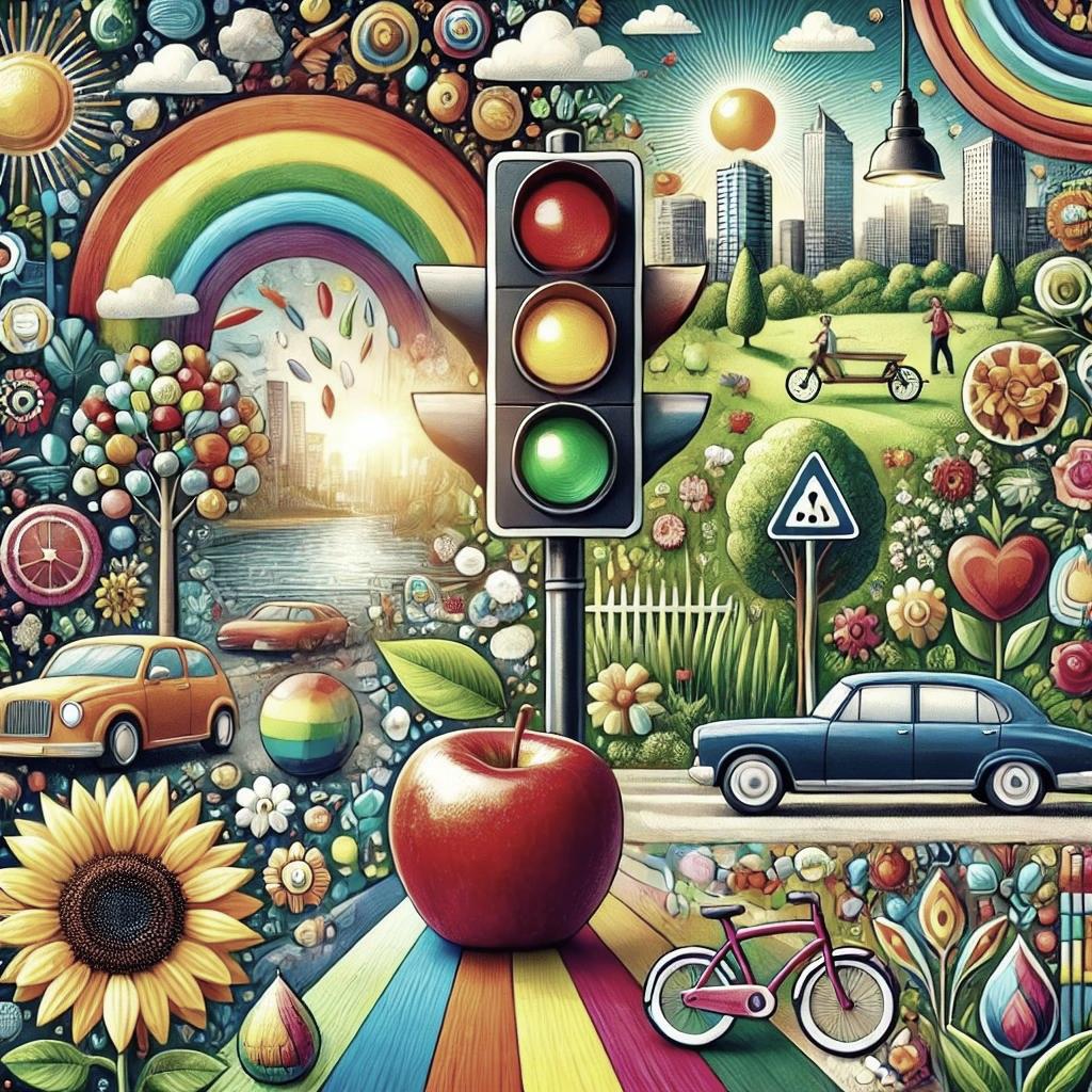
The property of Color can help us interpret differences among groups of objects and to take direction (for example, traffic lights).
Understanding the effects of color can lead to more effective communication, design, and interaction in various fields, making it an essential consideration in both personal and professional contexts.

Color is one of several key factors that influence design. Understanding how to coordinate colors is a vital skill when designing digital products and Graphical User interfaces.

Nature is filled with brilliant expressions of color.
Click here to see the different colors of flowers
- Red: Roses, poppies, tulips
- Pink: Cherry blossoms, peonies, carnations
- Orange: Marigolds, lilies, dahlias
- Yellow: Sunflowers, daffodils, tulips
- Green: Some varieties of orchids and chrysanthemums, hellebores
- Blue: Delphiniums, hydrangeas, cornflowers
- Purple: Lavender, violets, irises
- White: Daisies, lilies, gardenias
- Black (Dark Purples/Deep Reds): Certain tulips, pansies, and lilies

In the animal kingdom, colors play an essential part in survival. For example, camouflage (cryptic coloration) helps disguise location, identity, and movement. Animals also use colors to attract mates.
Learn more about Plants and Color by clicking here
Color in plants plays several important roles, primarily related to their survival and reproduction. Here’s a brief overview of the functions and significance of color in plants:
1. Photosynthesis:
- Green Color (Chlorophyll): The most abundant pigment in plants is chlorophyll, which gives plants their green color. Chlorophyll is essential for photosynthesis, the process by which plants convert light energy into chemical energy. It absorbs light most efficiently in the blue and red parts of the electromagnetic spectrum but reflects green light, which is why plants appear green.
2. Attracting Pollinators:
- Flowers: The bright colors of flowers are often due to pigments like anthocyanins (reds, purples, and blues) and carotenoids (yellows, oranges, and reds). These colors are crucial for attracting pollinators such as bees, butterflies, and birds. Different pollinators are attracted to different colors, so a plant’s flower color can influence the types of pollinators it attracts.
- UV Patterns: Some flowers have patterns visible only in ultraviolet light, which is visible to some insects like bees, helping them find the nectar.
3. Seed Dispersal:
- Fruits: The colors of fruits often change as they ripen, signaling to animals that the fruit is ready to be eaten. Brightly colored fruits are more likely to attract animals, which then eat the fruit and disperse the seeds, aiding in plant reproduction.
4. Protection from Herbivores:
- Pigments like Anthocyanins: These can also serve a protective function. Some pigments can deter herbivores by making the plant less palatable or by signaling toxicity.
- Camouflage: Some plants have colors that help them blend into their environment, making them less visible to herbivores.
5. Stress Responses:
- Anthocyanins and Other Pigments: In response to environmental stressors like excessive light, cold, or drought, plants may produce pigments that help protect cells from damage. For example, anthocyanins can protect against light damage by absorbing excess light.
6. Temperature Regulation:
- Leaf Colors: In some cases, the color of leaves can influence their temperature. Darker leaves may absorb more heat, which can be beneficial in colder environments, while lighter leaves reflect more light, which can help keep the plant cooler in hot environments.
7. Signaling and Defense:
- Warning Colors: Some plants develop bright colors as a warning to potential herbivores that they are toxic or unpalatable. This is seen in some berries and leaves that turn bright colors when they become more toxic during certain stages of their life cycle.
Overall, color in plants is a multifunctional trait that plays a vital role in their survival, reproduction, and interactions with their environment
It All Begins with Isaac Newton
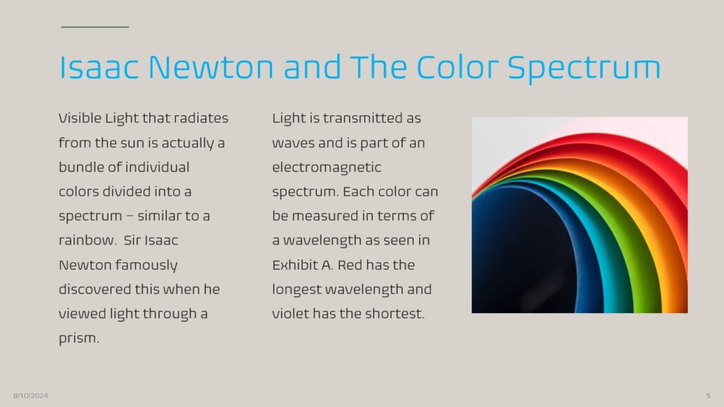
Newton’s discovery along with his many other accomplishments have earned him a place in the STEAM Pilots Halls of Fame – locate Newton on and read more about him by following this link.
Now Watch this Video on Newton’s Light Experiment
The Electromagnetic Spectrum

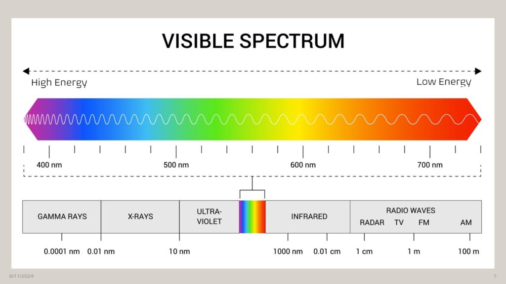
This chart represents the visible wavelengths of light along the electromagnetic spectrum. Notice that the scale is in Nanometers (1 billionth of a meter wide).
Here you can see how the visible spectrum of colors co-exist with Gamma Rays, X-Rays, Ultra-Violet and Infrared Light, and Radio Waves. We have the Scottish physicist, James Clerk Maxwell, to thank for tying all of this together. Maxwell’s Classical Theory of Electromagnetic Radiation described electricity, magnetism and light as all being part of the same phenomenon.
The Color Wheel
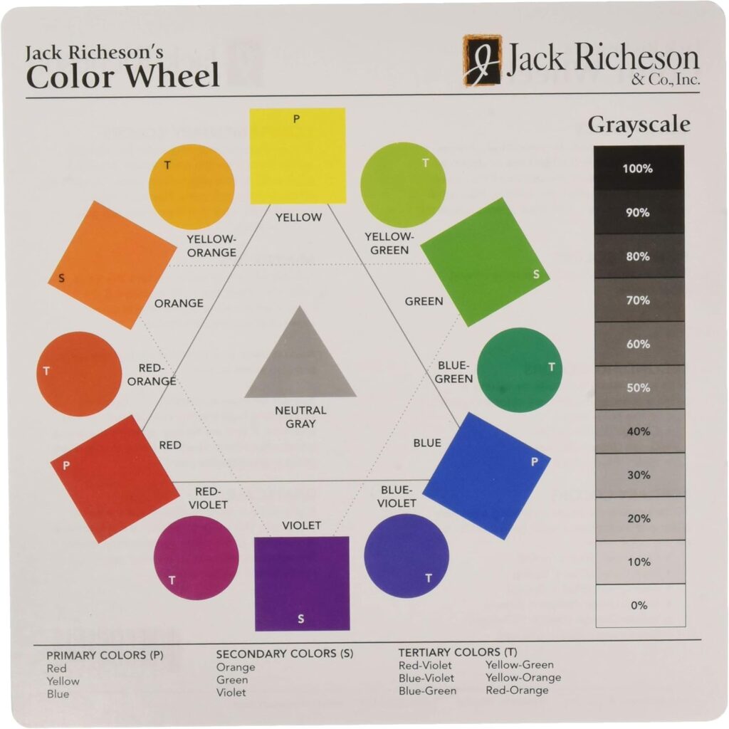
Once he had split white light into a spectrum by means of a prism, Newton wrapped the resulting spectrum around itself to create the color wheel. This led to the common definition of red, yellow, and blue as primary colors and orange, green, and violet as secondary colors. The other six came to be known as tertiary colors.
Newton proposed that colors opposite one another on the circle are complementary and cancel each other out. For example, yellow and violet are complementary – green and red, blue and orange – and so forth.
Jack Richeson’s Color Wheel is an excellent learning resource and is available for sale on Amazon.com.
Test out your knowledge of Complementary Colors by watching the following video
Properties of Color

- Hue – a color in the visible spectrum
- Primary Colors – Red, Orange, Yellow, Green, Blue, Indigo, Violet
- Secondary Colors – Green (Blue plus Yellow), Orange (Red plus Yellow), Violet (Blue plus Red)
- Tertiary Colors – Yellow-Orange (Amber), Red-Orange (Vermillion), Red-Violet (Magenta), Blue-Violet (Lavender) , Blue-Green (Turquoise)
Additional Properties of Color
- Value – A shade of lightness – Tones (add gray), Tints (add White), Shades (Add Black)
- Chroma (i.e., Saturation) – The intensity of the Hue – Vivid vs. Muted
- Temperature – refers to how warm or cool a color is, depending on where it’s situated on the color wheel. Colors in the yellow, orange, and red spectrum are warm, while colors in the green, blue, and violet spectrum are cool.
Standardization of Color

- Munsell System - 3-dimensional representation of Hue, Value, and Chroma
- Pantone System – Standardized Color Matching system
- Color-Aid Color System
- Sherwin Williams Color Snap Visualizer App for iPad

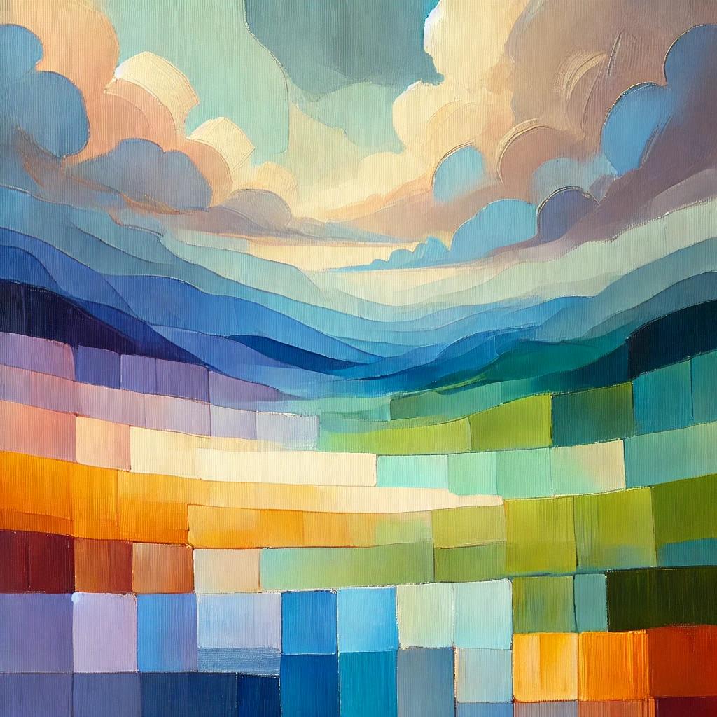
The painting exemplifies excellent color theory with a thoughtful balance of complementary and analogous colors. Soft blues blend effortlessly into gentle greens, creating a serene background that exudes tranquility. Warm oranges and yellows are strategically placed to contrast with the cool tones, adding vibrancy and drawing the viewer’s attention without overwhelming the scene. Cool purples are used to create depth and subtle shadows, enhancing the overall composition. The transitions between colors are smooth and cohesive, making the painting feel unified and harmonious. The placement of colors is deliberate, ensuring that no single area dominates, allowing the viewer’s eye to move naturally across the canvas, resulting in a visually pleasing and balanced artwork.
See more
The painting uses several key principles of color theory to create a harmonious and visually pleasing composition:
- Complementary Colors: Warm oranges and yellows are placed against cool purples, which are direct opposites on the color wheel. This contrast enhances both colors, making them appear more vibrant and dynamic. The use of complementary colors adds energy and interest to the painting without causing visual discord.
- Analogous Colors: The soft blues and gentle greens are next to each other on the color wheel, creating a soothing and cohesive transition. Analogous colors are used to build a serene, unified background that provides a calming effect and helps guide the viewer’s eye naturally across the painting.
- Split-Complementary Scheme: The painting may also employ a split-complementary scheme, where the dominant color (for example, blue) is paired with the two colors adjacent to its complement (such as orange and yellow). This approach provides a high contrast, but with less tension than a direct complementary scheme, contributing to a more balanced and harmonious composition.
- Triadic Color Scheme: Subtle hints of a triadic scheme could be present, where three colors that are evenly spaced around the color wheel, such as blue, red, and yellow, are used to create a vibrant yet balanced look. In the painting, the presence of these colors would add variety while maintaining harmony.
- Use of Value and Saturation: The painting carefully controls the value (lightness or darkness) and saturation (intensity) of the colors. Soft, muted tones (low saturation) in the background prevent the colors from clashing, while more vibrant hues (high saturation) in focal areas draw attention and create emphasis without overwhelming the viewer.
These principles work together to create a painting that feels balanced, unified, and aesthetically pleasing, demonstrating a sophisticated understanding of color theory.
Hex Colors used in this painting
The painting effectively utilizes color theory by combining specific hex colors in a harmonious and visually appealing manner:
- Complementary Colors:
- #FF8C00 (a warm orange) is paired with #6A0DAD (a cool purple). These complementary colors are opposite each other on the color wheel, creating a vibrant contrast. The orange (#FF8C00) stands out against the purple (#6A0DAD), enhancing the visual impact of both colors.
- Analogous Colors:
- #ADD8E6 (light blue) and #90EE90 (light green) are used as analogous colors. These colors are next to each other on the color wheel and share a common base, creating a smooth transition. The light blue (#ADD8E6) and light green (#90EE90) blend seamlessly, providing a soothing and cohesive background.
- Split-Complementary Scheme:
- The dominant color #4682B4 (steel blue) is paired with #FF4500 (orange-red) and #FFD700 (gold). Instead of pairing steel blue (#4682B4) with its direct complement (orange), the artist uses the colors adjacent to it (orange-red #FF4500 and gold #FFD700). This split-complementary scheme maintains a vibrant contrast while being less intense than a direct complementary pairing.
- Triadic Color Scheme:
- The painting might also use a triadic color scheme with #4682B4 (steel blue), #FFD700 (gold), and #FF4500 (orange-red). These three colors are evenly spaced on the color wheel and work together to create a balanced yet dynamic composition.
- Use of Value and Saturation:
- The painting likely incorporates varying levels of saturation and value. For example, #D3D3D3 (light gray) could be used to mute the intensity of certain areas, providing a softer backdrop that allows more saturated colors like #4682B4 (steel blue) or #FF4500 (orange-red) to stand out. Darker values, such as #2F4F4F (dark slate gray), may be used to create depth and contrast within the composition.
These specific hex colors, when combined with an understanding of color theory, contribute to a painting that feels cohesive, balanced, and visually engaging.
Now look at how the various Color Systems around the world could be used to describe our painting (Oh and maybe you guessed – the painting was AI-generated (using DALL-E 3)
Pantone Color System
Using the Pantone color system to explain the painting’s use of color theory, we can identify specific shades that align with the principles of complementary, analogous, and other color schemes:
- Complementary Colors:
- Pantone 151 C (a vibrant orange) is paired with Pantone 2685 C (a deep violet). These colors are complementary, meaning they are opposite each other on the color wheel. The orange (Pantone 151 C) stands out vividly against the deep violet (Pantone 2685 C), creating a dynamic contrast that draws attention and adds energy to the painting.
- Analogous Colors:
- Pantone 298 C (a soft blue) and Pantone 367 C (a light green) are used as analogous colors. These colors sit next to each other on the color wheel and share a common hue, allowing them to blend smoothly. The soft blue (Pantone 298 C) and light green (Pantone 367 C) create a harmonious and calming transition, perfect for backgrounds or serene areas of the composition.
- Split-Complementary Scheme:
- The dominant color might be Pantone 7706 C (a medium blue), paired with Pantone 172 C (a bright orange) and Pantone 1235 C (a warm yellow). Instead of pairing the medium blue (Pantone 7706 C) with its direct complement, the artist uses the adjacent colors on the color wheel (orange Pantone 172 C and yellow Pantone 1235 C). This split-complementary scheme offers contrast while maintaining harmony, avoiding the harshness of a direct complement.
- Triadic Color Scheme:
- The painting might also employ a triadic color scheme using Pantone 7706 C (medium blue), Pantone 1235 C (warm yellow), and Pantone 172 C (bright orange). These three colors are evenly spaced on the color wheel, offering a balanced yet vibrant composition. Each color in this triadic scheme plays off the others, adding variety while maintaining equilibrium.
- Use of Value and Saturation:
- Different values and saturations of Pantone colors are used to add depth and emphasis. For instance, Pantone Cool Gray 2 C (a light, neutral gray) might be employed to tone down certain areas, allowing more vibrant colors like Pantone 172 C (bright orange) to pop. Pantone 7546 C (a deep blue-gray) could be used to create shadows and depth, providing contrast against lighter or more saturated tones.
These Pantone colors, when applied with an understanding of color theory, help to create a painting that is both visually striking and harmonious, with a well-balanced use of contrast, harmony, and depth.
Munsell Color System
The Munsell system describes colors based on three attributes: hue, value (lightness), and chroma (intensity).
Using Munsell 5Y 7/10 (yellow), Munsell 5R 5/14 (red), and Munsell 5BG 6/8 (blue-green) creates a balanced triadic scheme. Each color is evenly spaced on the Munsell hue circle, providing a lively and dynamic balance across the painting.
Complementary Colors:
Munsell 5R 5/14 (a vivid red) is paired with Munsell 5G 5/8 (a green). These hues are opposite each other on the Munsell color wheel, creating a strong contrast. The red’s high chroma (14) provides a vibrant focal point, while the green’s slightly lower chroma (8) balances the intensity without overwhelming the viewer.
Analogous Colors:
Munsell 5PB 6/4 (a blue-purple) and Munsell 5P 5/4 (a purple) are analogous. These colors sit next to each other on the Munsell hue circle, with similar values and chroma, creating a smooth and harmonious gradient in the painting. The similar lightness (value) and moderate intensity (chroma) ensure that the colors blend seamlessly.
Split-Complementary Scheme:
A dominant hue might be Munsell 10B 4/6 (a blue), paired with Munsell 5Y 7/10 (a yellow) and Munsell 5YR 6/12 (an orange). The blue hue contrasts with the yellow and orange, which are not direct complements but close enough to create a vibrant yet less intense contrast.
Triadic Color Scheme:
Ral Color System (The acronym RAL originally stood for “Reichs-Ausschuss für Lieferbedingungen,” which translates to “Reich Committee for Terms and Conditions of Sale” in English.
The RAL system is widely used in Europe, particularly in architecture and design. It categorizes colors with a four-digit number.
A triadic scheme could use RAL 6018 (Yellow Green), RAL 5005 (Signal Blue), and RAL 3020 (Traffic Red). These colors are evenly spaced on the RAL color wheel, offering a lively yet harmonious composition.
Complementary Colors:
RAL 2004 (Pure Orange) can be paired with RAL 5002 (Ultramarine Blue). These complementary colors are opposites on the color wheel, with the bright orange (RAL 2004) standing out against the deep blue (RAL 5002), creating a striking visual contrast.
Analogous Colors:
RAL 5015 (Sky Blue) and RAL 6027 (Light Green) are analogous colors. These colors are near each other on the color spectrum, providing a smooth, gradient transition from blue to green, enhancing the painting’s harmonious feel.
Split-Complementary Scheme:
Using RAL 6032 (Signal Green) as the dominant color, paired with RAL 3020 (Traffic Red) and RAL 1023 (Traffic Yellow), creates a split-complementary scheme. The green contrasts with the red and yellow, providing a vibrant yet balanced look.
Triadic Color Scheme:
A triadic scheme could use RAL 6018 (Yellow Green), RAL 5005 (Signal Blue), and RAL 3020 (Traffic Red). These colors are evenly spaced on the RAL color wheel, offering a lively yet harmonious composition.
The Natural Color System
The NCS system is based on how the human eye perceives color, describing colors using a notation of hue and chromaticness.
- Complementary Colors:
- NCS S 1080-Y70R (a strong orange-red) could be paired with NCS S 3060-B (a deep blue). These complementary colors are opposite in hue, with the orange-red and deep blue creating a strong contrast that adds vibrancy to the painting.
- Analogous Colors:
- NCS S 1050-G60Y (a light yellow-green) and NCS S 0570-Y10R (a pale yellow) are analogous. They sit close together on the color spectrum, creating a smooth and cohesive transition that’s pleasing to the eye.
- Split-Complementary Scheme:
- Using NCS S 2060-B (a strong blue) as the dominant hue, paired with NCS S 1070-Y (yellow) and NCS S 1080-Y70R (orange-red), forms a split-complementary scheme. The blue contrasts well with the yellow and orange-red, providing a vibrant but less jarring effect than a direct complement.
- Triadic Color Scheme:
- A triadic scheme in NCS could include NCS S 1080-Y70R (orange-red), NCS S 3060-B (blue), and NCS S 1070-G40Y (yellow-green). These colors are evenly spaced around the NCS color wheel, offering a balanced and vibrant combination.
These color systems, when applied using color theory, ensure that the painting’s colors work together harmoniously, creating a balanced, visually appealing, and cohesive artwork.
The Joen Wolfrom Essential Card Deck Simplifies Color Theory
Set yourself free from the color wheel and choose a color confidently with this comprehensive set of coordinated color cards. Compare colors and explore combinations to create unique color schemes that best suit your project. The 200-card deck contains 168 color cards in vibrant hues, pastel tints, muted tones, rich shades, eight value cards, black through gray to white, and 24 brown through beige neutral color cards. Each 2.5″ x 4″ card has a solid color on the front, and the back includes the color name, color plans (complementary, analogous, split-complementary, and triadic), and a unique color number to help you sort, choose, and explore.
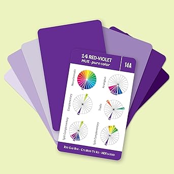
This kit includes RGB / CMYK / HEX codes and a handy color guide with basic color theory and tips for using your Essential Color Card Deck.
Not all Color Schemes Work together
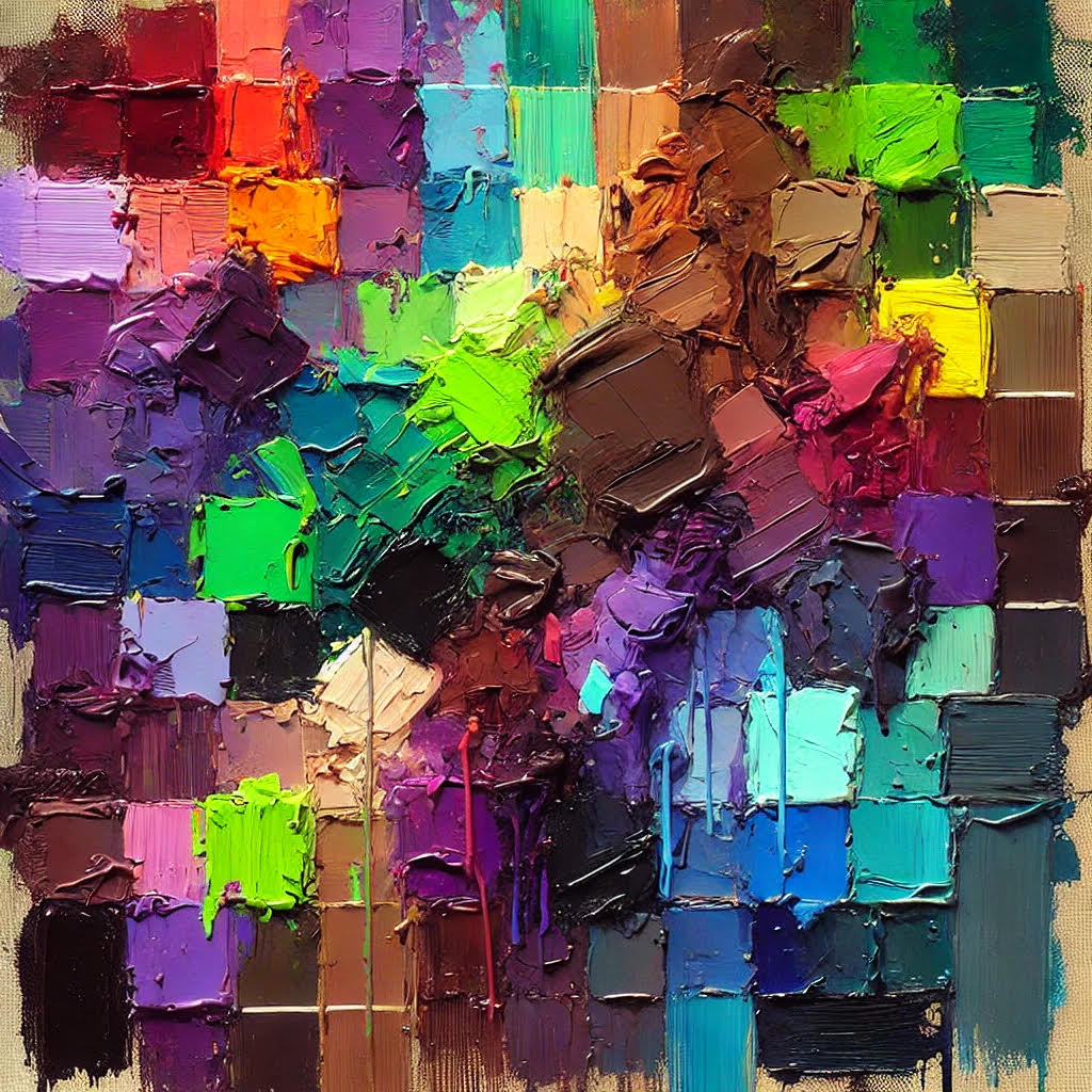
The painting in this image features a chaotic mix of colors that clash and create visual discomfort. Bright neon greens are placed right next to dark purples, which creates an unsettling contrast. Muddy browns are scattered throughout, poorly blending with overly saturated reds and blues. The composition lacks any sense of harmony or balance, with the colors feeling disjointed and out of place. The overall effect is a jarring, visually unpleasant image, where none of the colors complement each other, making it a clear example of bad color theory application.
Mathematics of Color
Colors measured in wavelengths in a range – appx. 400-700 nanometers
Nanometer is 1 billionth of a meter
Division of color wheel into three equal parts, each 120 degrees apart
Offers a vibrant and balanced look, with each color providing contrast to the others
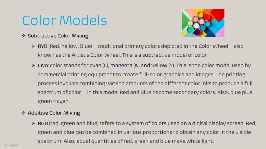
RGB Color Model – Red, Green, Blue can be combined in any proportions to obtain any color in the visible spectrum.
Each color is assigned 8 bits from 0 to 23. Each color also has values ranging from 0 to 255 (256 levels for each color) For example, if a color has zero Blue, it will be a mixture of Red and Green. This means we can generate 256x256x256 = 16,777,216 possible colors!
Hexadecimal Value
Hexadecimal values are used to represent colors in digital design, typically in web development and graphic design. A hexadecimal color value is a six-digit combination of letters and numbers. The format is #RRGGBB, where:
RRrepresents the red component (00 to FF),GGrepresents the green component (00 to FF),BBrepresents the blue component (00 to FF).
For example:
#FF0000is pure red.#00FF00is pure green.#0000FFis pure blue.#FFFFFFis white.#000000is black.
Vector Graphics
Vector graphics and color are fundamental concepts in digital design, especially in creating scalable and visually appealing images. Here’s an overview:
Vector Graphics
- Definition: Vector graphics are images created using mathematical equations to define geometric shapes like lines, curves, circles, and polygons. Unlike raster graphics, which are made up of pixels, vector graphics are resolution-independent, meaning they can be scaled up or down without losing quality.
- File Formats: Common vector file formats include SVG (Scalable Vector Graphics), AI (Adobe Illustrator), EPS (Encapsulated PostScript), and PDF.
- Uses: Vector graphics are ideal for logos, icons, technical illustrations, and any artwork that requires scalability. They’re often used in web design, branding, and print media.
Color in Vector Graphics
- Color Models: Vector graphics use color models like RGB (Red, Green, Blue) for digital screens and CMYK (Cyan, Magenta, Yellow, Black) for print.
- Hexadecimal Colors: In web design, vector graphics often use hexadecimal color codes to define colors (e.g.,
#FF5733). - Gradients: Vector graphics can incorporate gradients, which are smooth transitions between two or more colors. These can be linear or radial, adding depth and dimension to the design.
- Transparency: Vector graphics can also utilize transparency or opacity levels, allowing designers to create overlapping objects with varying degrees of visibility.
- Spot Colors: In print, spot colors (pre-mixed inks) can be used in vector graphics for consistent color matching across printed materials.
Combining Vector Graphics and Color
- Color Palettes: Designers often use color palettes to maintain consistency in vector graphics. Tools like Adobe Illustrator allow the creation and application of custom color swatches.
- Shading and Highlights: Although vector graphics are primarily flat, designers can simulate depth and volume using color shading, highlights, and gradients.
- Stylization: Vector graphics can be stylized with specific color themes, such as monochromatic schemes or complementary color schemes, to achieve a particular look and feel.
Read more (Caution: gets incredibly Nerdy :-))
Mathematics of color involves several concepts from fields like physics, geometry, and linear algebra. It focuses on how colors are represented, combined, and manipulated mathematically, essential in digital imaging, design, and various scientific applications.
1. Color Spaces
- RGB Color Model:
- The RGB model is based on the additive color theory, which states that colors are created by combining red, green, and blue light at various intensities.
- Mathematically, a color is represented as a vector [R, G, B][R, G, B][R, G,B], where each component ranges from 0 to 255 in 8-bit representation or from 0 to 1 in normalized form.
- Example: Pure red is [255,0,0][255, 0, 0][255,0,0], pure green is [0,255,0][0, 255, 0][0,255,0], and pure blue is [0,0,255][0, 0, 255][0,0,255].
- CMYK Color Model:
- The CMYK model is based on subtractive color theory and is used in color printing.
- Colors are a combination of cyan, magenta, yellow, and key (black) values.
- Conversion from RGB to CMYK involves a series of mathematical transformations that account for how inks combine on paper.
- HSV/HSB Color Model:
- HSV (Hue, Saturation, Value) or HSB (Hue, Saturation, Brightness) is a cylindrical coordinate representation.
- Hue is an angle (0° to 360°), Saturation is the radius (0 to 1), and Value/Brightness is the height (0 to 1).
- The transformation from RGB to HSV involves normalizing RGB values and applying trigonometric functions to calculate the hue.
- CIELAB Color Space:
- CIELAB is designed to be perceptually uniform, meaning that the same amount of numerical change in these values corresponds to roughly the same amount of visually perceived change.
- L represents lightness, and a and b are chromaticity coordinates.
- Conversion between RGB and CIELAB involves a non-linear transformation that considers human color perception.
2. Color Mixing
- Additive Mixing (RGB):
- Colors are added together using the RGB model. The result of mixing colors depends on the addition of their corresponding components.
- Example: Mixing red [1,0,0][1, 0, 0][1,0,0] and green [0,1,0][0, 1, 0][0,1,0] produces yellow [1,1,0][1, 1, 0][1,1,0].
- Subtractive Mixing (CMYK):
- In subtractive mixing, colors are subtracted from white light using pigments, inks, or dyes.
- Mathematically, the combination of cyan [C][C][C], magenta [M][M][M], and yellow [Y][Y][Y] is expressed as the subtraction of these colors from white.
3. Color Perception and CIE XYZ
- CIE XYZ Color Space:
- Developed by the International Commission on Illumination (CIE), it represents color in a way that reflects human color perception.
- X, Y, and Z are the tristimulus values that represent a color based on how human eyes perceive light. Y corresponds to luminance, while X and Z are color information-related.
- The conversion from RGB to CIE XYZ involves a linear transformation using a matrix of coefficients that model how the human eye responds to different wavelengths of light.
4. Color Differences (ΔE)
- The mathematical expression for color difference is often calculated using the ΔE formula, which quantifies the perceived difference between two colors.
- ΔE is calculated as: ΔE=(L2−L1)2+(a2−a1)2+(b2−b1)2\Delta E = \sqrt{(L_2 – L_1)^2 + (a_2 – a_1)^2 + (b_2 – b_1)^2}ΔE=(L2−L1)2+(a2−a1)2+(b2−b1)2
- Here, L1,a1,b1L_1, a_1, b_1L1,a1,b1 and L2,a2,b2L_2, a_2, b_2L2,a2,b2 are the CIELAB coordinates of the two colors being compared.
- A ΔE value of less than one is usually considered invisible to the human eye.
5. Color Quantization
- Color quantization is reducing the number of distinct colors in an image. This is done using algorithms that select a representative set of colors, typically used in image compression.
- K-means clustering is a common algorithm used for color quantization, where colors are grouped into clusters, and each pixel is assigned the nearest color center.
6. Color Harmony and Mathematical Ratios
- In design, color harmony often relies on mathematical ratios to create aesthetically pleasing combinations.
- Golden Ratio (1:1.618): Applied in color design to balance proportions in color usage.
- Rule of Thirds: Used in visual composition, including the distribution of colors across a layout.
7. Spectral Power Distribution (SPD)
- SPD represents the power per unit area per unit wavelength of light.
- Mathematically, it’s often represented as a function S(λ)S(\lambda)S(λ), where λ\lambdaλ is the wavelength.
- This function is integral to understanding how light sources affect perceived color and is used in color matching.
The mathematics of color is an interdisciplinary field, touching on computer science, physics, and visual arts. Understanding these mathematical principles is crucial for accurate color reproduction, digital imaging, and creating visually appealing designs.
How Our Eyes and Brain Identify Colors
Key Points
- There is a path of visual information from the eye to the brain, starting with the optic nerve and leading to the visual cortex.
- The brain interprets signals from the cones to create the perception of color through a process called color opponency.
- The retina is covered with millions of light-sensitive neuron cells called rods and cones. When these cells detect light, they send signals to the brain. Rods are ultra-sensitive to light levels and help us achieve good vision in low light. They also help to identify shapes and figures. Cone cells can detect colors. Most people have three kinds of cone cells, one type for Red, one for Green, and One for Blue.
- Colorimetry is the science and technology that quantifies and physically describes human color perception.
- A major objective of Colorimetry is the numerical description of colors in such a way that two objects with the same specification for a given set of conditions are always perceived to have the same color under those conditions.
- A colorimeter can measure the absorbency of light waves. During color measurement, the change in the intensity of electromagnetic radiation in the visible wavelength region of the spectrum is measured after transmission or reflection by an object or solution.
Art and Color
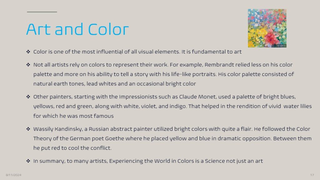
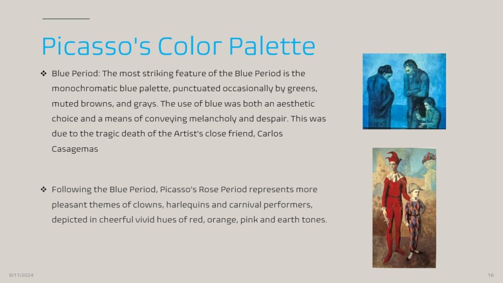
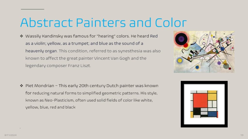
Colors in Nature
Colors and Animal Life
- It covers camouflage, bioluminescence, and the use of colors to attract mates. It also covers how certain animals use coloration to regulate body temperature and thwart pests.
- Iridescence and Bioluminescence are also vital concepts here
Colors and Plant Life
- Many students already know about green chlorophyll and its role in photosynthesis. Still, they may find it fascinating to know that blue light helps encourage vegetable leaf growth and that red light, when combined with blue, allows plants to flower.
- Carotenoid, Betalains, and Anthocyanin pigments
- Many people will think of beautiful hues and shades of flowers when pondering colors in nature.
Colors in the Universe
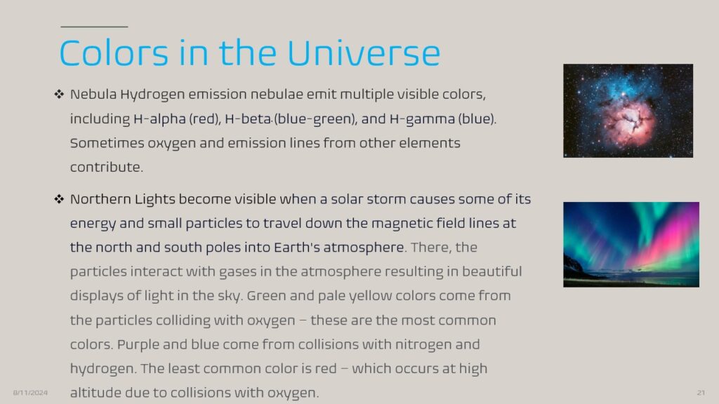
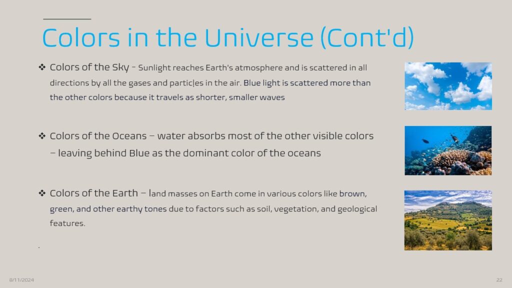
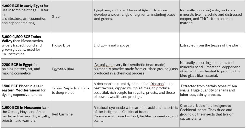
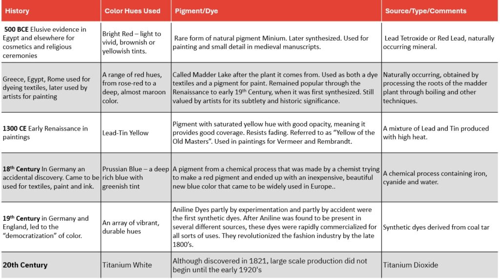
A History of Natural Pigments and Dyes
The history of natural pigments and colors is a story of nature, culture, civilization, art and science
The first example of paint-making was discovered a few years ago in South Africa, dating back about 100,000 years. The earliest paints would have used a variety of mineral and organic-based pigments. The paint found in South Africa was made from red iron oxide and charcoal, and bone marrow was used as a binder. Primitive pigments were used in the cave paintings in modern-day Lascaux, France, as many as 30,000 years ago.

Color Engineering and Nanotechnology

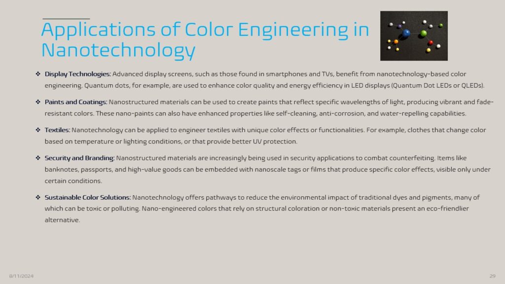
- Color engineering through nanotechnology represents an exciting and innovative area of research that leverages the unique properties of nanoscale materials to manipulate color in new and dynamic ways. This field intersects materials science, chemistry, physics, and engineering, aiming to create vibrant, durable, and less toxic colors for various applications, from displays and paints to textiles and security features.
- Structural Coloration: Unlike traditional pigments that rely on chemical properties to produce color, structural coloration uses the physical structure of materials to reflect light in specific ways. This is achieved through nanostructures that can manipulate light at the nanoscale, much like how iridescent colors are produced in nature (e.g., butterfly wings and peacock feathers). These structures create vivid colors through interference effects, diffraction, and scattering.
- Plasmonic Nanoparticles: These nanoparticles contain metals like gold and silver, which exhibit strong interactions with light due to their conduction electrons. When light hits these nanoparticles, it induces a collective oscillation of electrons known as surface plasmon resonance, which can be tuned to specific wavelengths by altering the nanoparticles’ size, shape, or composition. This results in vivid colors that are highly controllable and can be engineered for particular applications.
- Quantum Dots: Quantum dots are semiconductor nanocrystals with unique electronic properties due to their quantum mechanical nature. The color they emit depends on the size of the quantum dots: smaller dots emit blue light, while larger dots emit red. Quantum dots are used in display technologies, providing highly saturated and energy-efficient colors.
Colors and Information Technology

Colors, Logos and Branding

Colors and Digital Product Design


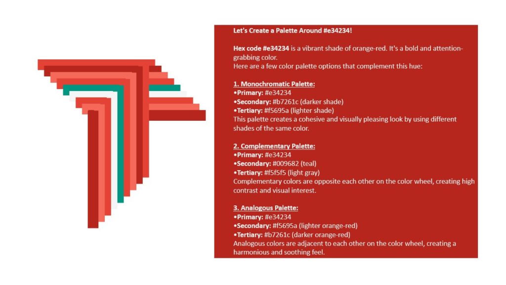
Quick Reference: Vermilion Hex, RGB, and CMYK Color Codes. The vermilion Hex Code is #E34234 . The RGB values are 227, 66, 52. The CMYK color codes, used in printers, are C:0 M:85 Y:87 K:0. In the HSV/HSB scale, #E34234 has a hue of 5°, 77% saturation, and a brightness value of 89%.
AI and Colors
Artificial intelligence (AI) has a significant impact on the use of colors in various fields, from
design and art to data visualization and marketing. Here’s an overview of how AI interacts
with colors:
Color Generation and Selection:
- AI can analyze color trends and generate palettes that align with the current design
aesthetics or cultural preferences. - Tools like Adobe’s AI-powered Color Wheel or DeepDream can create color schemes
based on user input, existing images, or even by learning from vast amounts of color usage
data.
Image and Video Processing:
- AI can automatically adjust colors in images and videos to enhance visual appeal or
match a specific style. - Algorithms can colorize black-and-white photos or videos by learning from existing color
images, offering a realistic representation of what those scenes might have looked like.
Personalization:
- In marketing, AI can personalize color schemes for websites, ads, and products based on
individual user preferences or demographic data. - By analyzing user interactions, AI can determine which colors are more likely to engage
specific audiences.
Creative AI Art:
- AI artists use neural networks to generate art with complex color schemes. These AI
models can mimic the styles of famous artists or create entirely new color compositions.
Data Visualization:
- AI can optimize the use of colors in data visualization, ensuring that charts and graphs
are aesthetically pleasing and effective in communicating information clearly. - It can adjust color contrasts to make visualizations more accessible to people with color
vision deficiencies.
Fashion and Design:
- AI is used in fashion to predict upcoming color trends based on historical data and social
media analysis. - Designers can use AI to simulate how different colors will look on various materials or in
different lighting conditions.
Color Psychology:
AI can analyze and predict the emotional impact of certain colors on individuals or
groups, which can be used in everything from interior design to branding strategies.
AI’s ability to process vast amounts of data and learn from it enables more sophisticated
and personalized use of colors across multiple disciplines.
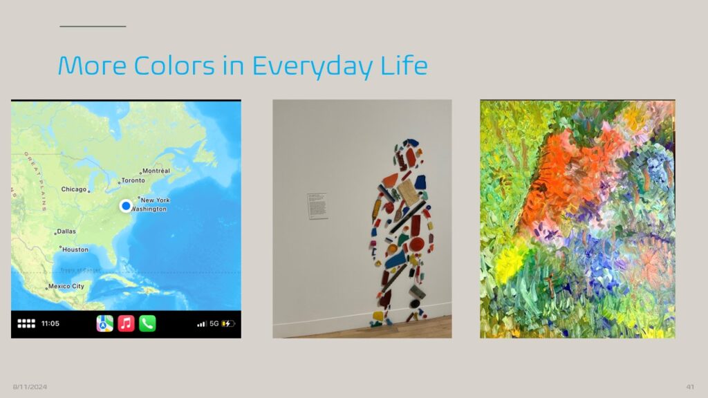
Colors in Everyday Life
One day I was walking around taking pictures with my phone and I captured these images of daily life. It occurred to me how different life would seem in black and white…
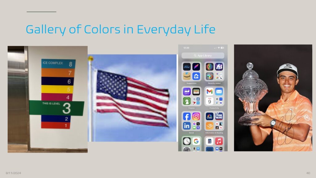
Yes – that is Ricky Fowler!
Conclusion
So now you have learned a good deal about the World of Colors. Now it is time to take a quiz and complete the assignments included at this lesson’s beginning. Good luck!
Internet Sources
Bibliography
- Bronowski, Jacob. The Ascent of Man. Little, Brown and Company, 1973
- St. Clair, Kassia. The Secret Lives of Color. Penguin Books, 2016
- Hibit, Eric. Color Theory for Dummies. For Dummies, 2022
- Sousa, David A., and Tom Pilecki. From STEM to STEAM: Using Brain-Compatible Strategies to Integrate the Arts. Corwin Press, 2013
- Kandinsky, Wassily. Concerning the Spiritual in Art. Translated by M.T.H. Sadler, Dover Publications, 1977. (Originally published in 1911)
- Goethe, Johann Wolfgang von. Theory of Colors. Translated by Charles Lock Eastlake, MIT Press, 1970. (Originally published in 1810)
STEM Supplies Available on Amazon
Acknowledgment
The following books and learning materials are available on this store through Steam Pilot’s Amazon Associate membership. As an Amazon Associate, we earn from qualifying purchases. Please note that we only display items that we personally use, either in developing lesson plans and other web content or when providing STEM and STEAM lessons and consultations to our students and educators.
- Jack Richeson’s Color Wheel
- Set of 4 Prisms
- KolormondoMini 3-D Colorwheel
- Crayola 96 Crayon Pack
- Joen Wolfrom Essential Color Card Deck –
When ready, please write a short essay about your favorite color and submit it using the following form. Why do you prefer that particular color? Think about that color and how it shows up in daily life – think of Professional Sports team colors, Company logos, wardrobe choices, and car colors. Does the color appear in Nature – think birds, flowers, and landscapes?
See if you can locate the Hex number for your color. See where it falls on the Color Wheel. Is it one of the seven colors you see when performing Newton’s experiment with Prisms?
No Fields Found.Now, use the buttons below to reinforce your understanding of this lesson by completing the Assignments and taking the quiz.
If you are done with the lesson, please provide the following feedback so that we may improve it. Your enrollment includes new content that will be made available in the coming weeks and months.
No Fields Found.